Keller Collection
Nature’s Palette: An Interview with Jeff Keller, Collector and Curator
Jeff Keller has always loved the outdoors while working over 40 years in the paint industry. Somewhere along the way, his two worlds collided and the Keller Collection was born. Jeff knew he wanted to assemble a collection of natural color that was representative of his surroundings. Jeff is the first to admit that he’s not at all an expert on the natural world, but just another casual observer drawn to the undeniable beauty of the Rocky Mountains. When not fine-tuning the KELLER COLLECTION or running his Bozeman paint store, The Paint Factory, he can be found recreating in the mountains of Southwest Montana with his dog, Kodi.
Interview with Jell Keller, Collector and Curator
Tell us first about the inspiration for the Keller Collection. It may seem obvious, but I suspect there is more to it.
Like most people who love the mountains and the outdoors, I’ve always appreciated what I see when I’m out there. At 54, I’ve been “playing” outside my whole life, but I’ve also dealt with color since my early teens, first as a house painter, then as a paint supplier in Southwest Montana. The original inspiration goes back 20+ years when I thought it would be fun to do something with regional color. It remained an idea until a few years ago when I decided to conduct a study of Fall foliage’s natural color in the Bridger Mountain range. After meeting Jim Foster, a horticulturist and naturalist, I shared with him what I had in mind. He said he’d love to assist me with identifying items in the casual collection. Jim was a wealth of knowledge, so I brought him in as a consultant. Not only was he invaluable in identifying the specimens, but with his vast knowledge, he also suggested areas I should go explore. As a result, we did multiple road trips in search of color, some areas familiar and others new to me.

How did you decide on the five categories and manage to come up with 460 different shades of natural coloring?
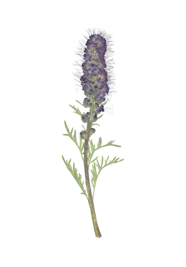
Throughout the first Fall season of the study, I shared my new hobby with friends and acquaintances, and most of them responded with enthusiasm! I was already seeing two categories of color within just the Fall foliage—monochromatic and also multi-colored items that I referred to as “inspirational.” During this time I took a step back and re-thought what I was trying to accomplish. Ideally, my study would ultimately show the spectrum of color found in the Rocky Mountain West. That’s when I identified the five categories I felt would convey the colors found throughout the Rocky Mountains and beyond. Those categories are Fall Color, Wildflowers, Rocks, Soils and Natural Grasses. The 460-color collection came later. Looking back, it would be accurate to say that this project evolved as organically as the subject matter itself.

What roles did Roper Green and Jim Schumacher play in developing this massive palette?
After a couple of years in the field, we had identified close to 1,000 items represented in the five categories. Although this was not a scientific study, I felt there was an adequate representation of the colors found in the various categories, so I began the curation process. That’s when my friend and colleague, Roper Green, got involved. Roper and I have been friends since college and he’s done all of the graphic design for The Paint Factory since we opened. Initially he created a spreadsheet that he, Jim Foster, and I worked together to populate with data collected from the field. Roper also suggested that we should photograph the collection, which resulted in our collection of Giclee fine art prints. Friends began to say “That thing needs a name!” We kicked around Rocky Mountain this, Rocky Mountain that, but nothing stuck. Roper’s wife, Katalin, suggested we call it the “Keller Collection,” which ended up sticking. I began to think about which items/colors would be most appropriate for paint colors. Benjamin Moore, with its massive 3,700+ color database, and one of the companies The Paint Factory represents, seemed like the natural choice. For clarification, the Keller Collection does not reinvent color, it merely defines Rocky Mountain color, so I knew accurate color representations existed in their industry-leading data base.
I identified 200 of our specimens from the five categories, then along with Benjamin Moore, Jim Schumacher, and our color-savvy staff at The Paint Factory, we began meticulously crossing over the items to the Benjamin Moore color palette. Two hundred items initially grew to almost 600 colors once we added a saturated (wet) option of each, resulting in a complementary color. In addition, I knew some people would look at a given color and say I love it but it’s too dark, so we took a calculated percentage of the original item and offered a “Light” version as well. By the time The Paint Factory staff completed this endeavor, they had made about 9,000 drawdowns out of actual paint, allowing us to create our custom Color Libraries with what ended up being 460 colors once redundancy was removed. I then organized the library into eight groupings: Off Whites, Neutrals, Muted Tones, Greens, Reds/Oranges/Pinks, Browns, Purples/Blues, and Yellows/Golds. Because this is a new and pretty unique body of work, a boutique collection as Roper calls it, it’s currently available exclusively through The Paint Factory in virtually any Benjamin Moore product. We are anxious to share it as an in-store, interactive and inspirational way to choose color relevant to the mountain landscape. The colors are all directly tied to a multitude of tangible items found in nature.

On a final note regarding the palette coming to fruition, everyone I enlisted played a key role, and possibly none greater than my longtime friend Jim Schumacher. It’s safe to say no one really has the time to undertake this kind of endeavor, I sure as hell didn’t! But with a rock star like Jim Schumacher managing my paint store, it afforded me the luxury of time and presence of mind to indulge myself in something that I really felt compelled to see through. Jim also built our custom reclaimed lumber picture frames for some of my favorite pieces, leading to our gallery collection. Additionally, he built our KC Display unit and matching conference table where our customers can work with the collection. It’s clear to me that the Keller Collection couldn’t have happened without him.
How do the seasons impact the natural color selection, and does that impact vary year-to-year?
The seasons are what make the collection full-spectrum, except for the rock and soil categories. They don’t care what month it is, which makes them the constants and arguably the foundation of the collection. Since I began to really pay attention, I’ve noticed that year to year foliage, flowers, and grasses ebb and flow with precipitation and temperatures, resulting in some years certain types of color didn't peak due to it being an off year. Good thing there is always next year.
Describe the process and effect you are trying to achieve with your art print offerings.
Roper and I approached the collection from different angles,
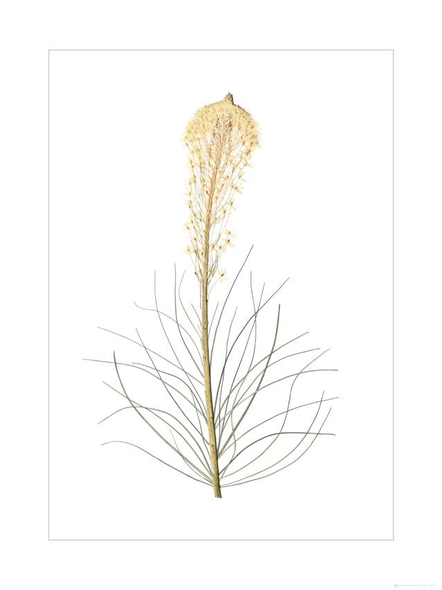
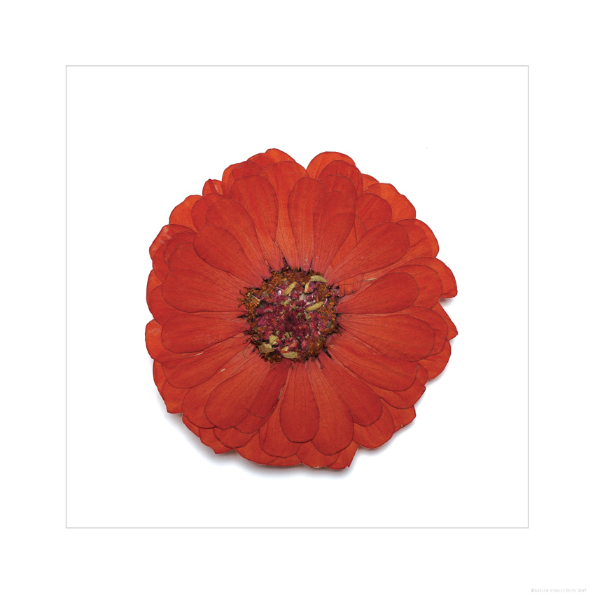
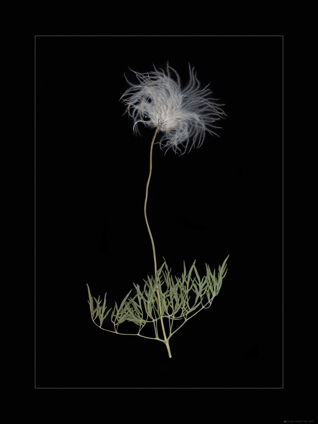
I always saw it as color, and he immediately saw it as a natural collection, which he felt needed to be documented with photos. The process and intention of the photography was to first and foremost capture the actual color of the specimens. Roper had a plan and we were quite happy with the outcome of those “diligent” efforts. What Roper also captured was dimension, many of the photographs are so life-like that many people seeing them for the first time feel the need to reach out and touch them to see if they were real pressings. Color & Dimension were the primary focus.
You have managed to create an interesting mix of artistry and business with your collection. How would you like to see your creation evolve over the next few years?
I don’t really see an end game for the Keller Collection; it just evolved over time into a pretty legit study in regional color that lends itself to a variety of things. When the heads of the Benjamin Moore color department came to work with the collection, BM color trend forecaster Nivara Xaykao commented “The cosmetic industry would love these soil colors!” That’s when there were 78, now there are 125 representing almost every color family. I’ve honestly just enjoyed people’s reaction to it all along. Since its’ completion it has been in two extended gallery showings, a couple of art walks, had some great editorial, and a fun launch party at the Rialto where Benjamin Moore, along with the Design, Construction and Art communities gave us a much-appreciated two thumbs up! It was also really cool to get a stamp of approval from Montana State University’s Land Resource Dept. (soils) and Earth Science Dept. (rocks). I couldn’t be more appreciative of Dr. Tony Hartshorn and graduate students Briana Whitehead and Jordan Allen for their shared interest in and time spent working with the Soils and Rock categories.
Finally, what do you hope people appreciate most about the Keller Collection?
Probably three things. First, its’ relevance throughout the West. These natural colors were identified all along Montana’s Rocky Mountain corridor, but can be seen and admired from the Rockies to the Sierras and everywhere in between. Secondly, the passion and effort that it took on the part of the many people who contributed to completing this “casual” collection of Rocky Mountain color. And last, nature is so full of color that it can be overwhelming, but once you slow down enough to get a given item by itself, you're able to appreciate its color and the part it plays in the big picture.


Leave a Comment Here